Dungeon Cleaner 0.0.22 - Visual Update Part 1!
Dungeon Cleaner » Devlog
Hello :)
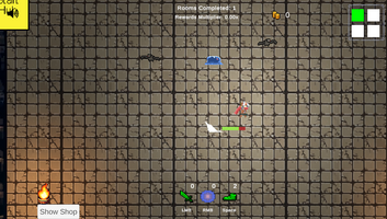
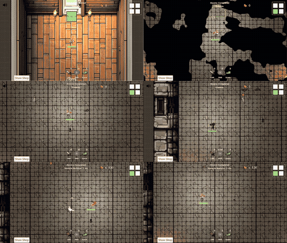
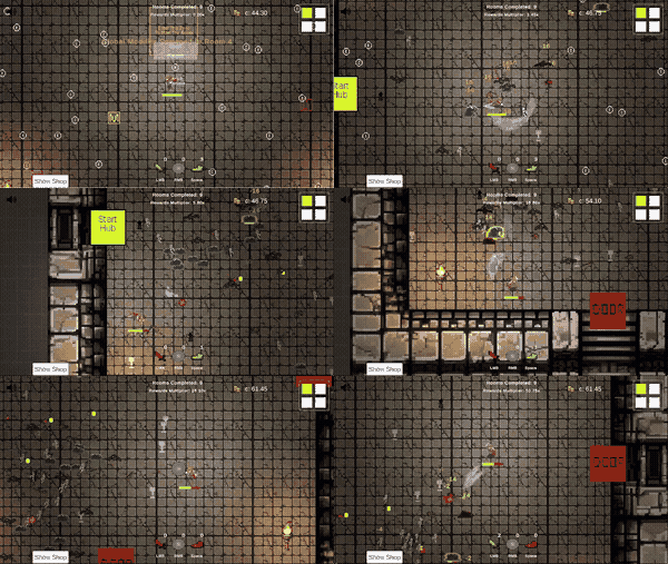
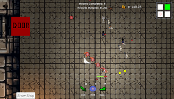
I put some work into updating many of the visuals. I wanted to release the progress so far, and in future updates, I'll continue updating much more.
Changes
- Lots of visual updates
- Updated player and added animations that reflect Dashing/Casting/Attack States
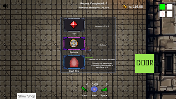
- Updated lots of reward icons
- Updated reward panel/map panel with a proper frame
- Updated the skeleton's visuals
- Added 2 new enemies - bats and slime
- Added a new heal-over-time reward (common variant, epic variant)
Enjoy!
Files
Dungeon Cleaner 0.0.22 Play in browser
Jun 11, 2024
Dungeon Cleaner
A fast paced, action packed, hack'n'slash. Play now!
| Status | In development |
| Author | Dutch |
| Genre | Action |
| Tags | 2D, Arcade, Fast-Paced, Indie, Pixel Art, Short, Singleplayer, Top-Down, Unity |
| Languages | English |
More posts
- Dungeon Cleaner 0.0.26 - Boss Portals!Jun 27, 2024
- 0.0.25.2 - minor fixes before reworksJun 26, 2024
- Dungeon Cleaner 0.0.25 - Magic MissileJun 17, 2024
- Dungeon Cleaner 0.0.24 - Balance Tweaks & MoreJun 16, 2024
- Dungeon Cleaner 0.0.23 - Bounties!Jun 15, 2024
- Dungeon Cleaner 0.0.21 - Super bosses and a new character!Jun 09, 2024
- Dungeon Cleaner 0.0.19 - Small TweaksJun 08, 2024
- Dungeon Cleaner - 0.0.18 - Special Attacks!Jun 01, 2024
- 0.0.17 - global modifiersJun 01, 2024
Comments
Log in with itch.io to leave a comment.
Nice job. Perhaps I would move to a color palette that highlights more the enemies and player from the ground, or another option would be to add an outline to them? Now, it gets too much blend with the ground in my opinion.
I think you’re right. The game has a border for stronger enemies (rare/elite) but nothing for common guys.
I’ve been playing around with the sizes of each enemy but I think the colour palette is the way to go and I’ll look to update it in the near future.